Successful bank websites have two things in common: effective user experience and user interface. User experience, or UX, deals with how your customer interacts with your site. Web developers ensure your bank website functions properly and in a way that meets users’ needs. User interface, or UI, is the actual design of the site. Web designers take into account the target audience to determine the content, color, and other design elements that will resonate the most with users. Without UI, UX wouldn’t be possible.
In this week’s blog, we’re going to review real-world examples of the proper use of UX and UI. Websites that focus on UX and UI are responsive, are accessible for all users, speak to their target audience, and build their brand.
- Being Mobile Responsive
- Designing for Web Accessibility and ADA Compliance
- Defining Your Target Audience and Your Brand
- Using Color to Reinforce Brand Identity and for Consistency
- Final Words
Being Mobile Responsive
In 2017, a Federal Reserve Board survey found that 21% of Americans use a mobile device for banking purposes. Having a mobile responsive bank website is important because it allows customers to reach you wherever they are and whenever they need to.
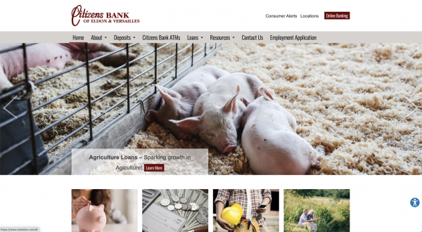
Let’s take a look at the website for Citizens Bank of Eldon & Versailles. The images below show how it appears on a desktop, smartphone, and tablet.

Desktop view of the Citizens Bank of Eldon & Versailles website.
iPad view of the Citizens Bank of Eldon & Versailles website.
iPhone view of the Citizens Bank of Eldon & Versailles website
Although the format adapts to the device, the layout and organization remain the same. By adjusting your website to fit any device, mobile responsiveness produces a consistent experience for the user and can also increase conversions.
Designing for Web Accessibility and ADA Compliance
As a financial institution, web accessibility and compliance with the Americans with Disabilities Act (ADA) won’t just help you avoid costly lawsuits; it will also help you meet federal examiner regulations. In our next example, Citizens Bank uses our ADA Accessibility Module. By installing the AudioEye tool, customers using assistive technology can have a similar user experience as those who don’t. Customers can also use the tool to view the bank’s accessibility certification.
The AudioEye tool on the Citizens Bank website.
Citizens Bank’s AudioEye certificate of accessibility.
Web accessibility and ADA compliance ensure all users, regardless of their abilities, can conduct business with you.
Defining Your Target Audience and Your Brand
One of the methods used to create impactful content is understanding your audience and creating a message strategy to reach them. Commonwealth National Bank proudly defines its mission and vision as one of only 15 black-owned banks in the country in its website design. The emphasis on diversity, inclusion, and equality is apparent through the articles shared on the home page and the photos used throughout the site.
![]()
Commonwealth National Bank Website home page
Your bank website design communicates what customers can expect when they do business with you. Showcase what makes you unique to attract the right customer base and to set yourself apart from the competition.
Using Color to Reinforce Brand Identity and for Consistency
Another important branding tool is the use of color. The color palette used in your bank website design should have meaning and purpose. The colors used on the Bank of Hillsboro website come from the company’s logo.
The web designer used the blue, orange, and teal from the logo thoughtfully and consistently throughout the site to create hierarchy and structure. Blue is used for headers. The orange color is used for buttons and subheaders. Teal is used as an accent color.
Bank of Hillsboro website home page
Bank of Hillsboro Personal Loans web page showing headers and subheaders
Using colors from or that complement the logo helps build brand identity and recognition. As a design element, the consistent use of the colors helps users comprehend the content.
Final Words
Designing your bank or credit union website around UX and UI shows users that you’re customer-focused. Great design attracts the right customers to your bank website and builds relationships with your customers.
The BankSITE® Services web design and development teams helped these four banks — and others — to create modern, ADA-compliant, and aesthetic websites. Find out how we can help you, too.


